UX Research
UI / UX Design
Wells Fargo's legacy search experience was a plain-text relic from 2012 with no visual hierarchy, no actionable results, and no brand coherence. As a Product Designer on the Experience Design team, I led concept design, prototyping, and hi-fidelity specification for a fully reimagined search platform — shipped live to wellsfargo.com.

Two transformational years — rebuilding the bank's digital experience from the inside out.
The years I was at Wells Fargo were defined by two parallel and deeply connected initiatives. The first was the Search Engine Platform Replacement — bringing eCommerce-grade search UX patterns to a major bank's B2C website. The second was the Brand Identity Modernization, spearheaded by the XD team — a complete overhaul of Wells Fargo's digital brand, design system, and digital assets. My mandate across both: apply new Digital Brand Standards to bridge gaps in the customer journey and achieve design coherence across platforms. The result — Wells Fargo ranked #1 in best app and mobile experiences in 2019 per Business Insider.
+1
Wells Fargo ranked best
app & mobile experience in 2019 — Business Insider
LIVE
New search experience
shipped to production on wellsfargo.com for all customers
eCom
eCommerce-grade search UX patterns applied to a major bank's customer-facing site
6
Design approach phases from concept through brand standards application
The Problem
A search experience built in 2012 — on a site serving millions of banking customers.
Wells Fargo's legacy search results page was a plain-text layout with no card structure, no visual hierarchy, no actionable CTAs, and no brand coherence. Customers searching for products, services, or support were met with a flat list of text results — the same pattern in place since the early 2000s. No preview modal. No auto-suggest. No Digital Brand Standards in sight.
The problem wasn't just aesthetic. A search experience that doesn't surface the right result in a scannable, actionable format costs conversions, erodes customer confidence, and undermines the broader digital transformation the XD team was driving. Banking customers have the same expectations online as any other eCommerce context — and the legacy experience met none of them.
At the same time, the Brand Identity Modernization project meant any new design needed to be built on the new Digital Brand Standards — establishing the search experience as a flagship demonstration of what the new Wells Fargo digital brand could deliver at scale.

The Approach
Concept to specification — bringing eCommerce search patterns to a FinTech B2C context.
My day-to-day on the XD team spanned partnering with product owners and developers in agile sprints and Value Stream project ceremonies across Lines of Business — applying new Digital Brand Standards to bridge gaps in the customer journey and achieve design coherence across platforms.
01
Concept Design & Ideation: I explored search patterns across FinTech and eCommerce to identify the right interaction model for Wells Fargo's B2C context — studying how major financial services and retail platforms surfaced results, handled zero-state, and guided customers from intent to action. The goal was to bring eCommerce-grade UX thinking to a banking context without losing the trust signals that matter in financial services.
02
Prototyping & User Testing in iRise: Concept options were prototyped in iRise and taken directly into Wells Fargo's in-house user testing lab at the San Francisco offices. Real customers participated in moderated usability sessions, evaluating competing design directions side-by-side. The chosen Action Card concept — featuring the preview modal, auto-suggest, and scannable card layout — outperformed the legacy pattern with an 85% task-completion rate, compared to 52% for the existing experience. Validated findings aligned stakeholders and locked in the design direction before committing to hi-fidelity specifications.
85%
Task completion rate
chosen concept
52%
Task completion rate
legacy experience
+33pts
Usability improvement vs.
legacy search
Lab
In-house user testing
Wells Fargo SF offices
03
Design Exploration — Filter & Sort Variants: As part of the iterative design process, I explored multiple approaches to filtering and sorting search results on mobile — a critical interaction for customers narrowing down products and services. Three design directions were developed and evaluated: a Sort Options control for reordering results by relevance or category, a compact Filter Panel for progressive disclosure, and an Expanded Filter Drawer for full filter access. The exploration informed the final interaction model for the North Star search results experience.
04
Hi-Fidelity UI Specifications: I delivered pixel-precise Sketch specifications covering all interaction states, spacing, color tokens, and typography for engineering handoff — ensuring the implementation team had everything needed to build the new search experience accurately and efficiently, with minimal rework cycles.
05
Digital Brand Standards Application: Every page and feature component was designed with the unifying elements of the new digital brand expression in mind — applying the Digital Style Toolkit to ensure the search experience felt coherent with the broader Wells Fargo digital transformation rather than a standalone redesign.
06
Agile & Value Stream Collaboration: I partnered with product owners and developers in agile sprints and Value Stream project ceremonies across Lines of Business — bridging design and engineering throughout the build process to ensure the shipped experience matched the approved design intent.
Brand Identity Modernization
The digital foundation that made the new search possible.
The Search Platform Replacement didn't happen in isolation. It was one of the flagship deliverables of a broader Brand Identity Modernization effort led by the XD team — a complete overhaul of Wells Fargo's digital brand identity, assets, and design system.
My role was to apply those new Digital Brand Standards directly to the search experience — ensuring every interaction state, card component, and typographic choice was a demonstration of what the modernized Wells Fargo brand looked like in motion, at scale, on a B2C product used by millions of customers.
Unified Digital Brand Standards
New design language applied consistently across web, mobile, and in-branch digital surfaces — built to replace years of fragmented expression.
Typography & Color System
Modernized type scale and accessible color palette aligned to Wells Fargo's refreshed brand identity — applied to every search state and result card.
Digital Style Toolkit
Centralized library of components, tokens, and guidelines ensuring design coherence across all Lines of Business — the foundation every new feature was built on.
Reusable Component Design System
Coded components enabling consistent UX patterns across all Lines of Business — the search Action Card was designed as a reusable system component.
I worked with within the core project team to iterate and create the initial concepts, interactive prototypes for user testing, and interaction and visual design specifications for our developers to code from.

What I Learned
If you’re like me, having a visual aid always helps to gain a better understanding of the project scope. To that end, I adapted the “Major Project Deliverables” into a site map with the features organized by page. This allowed me to grasp all of the components of this project and how they fit together to form a holistic searching experience, and I thought it could serve the greater team and maybe facilitate further discussion.

The Solution
An eCommerce-grade search experience — Action Cards, Auto-Suggest, and a live preview modal — shipped to wellsfargo.com.
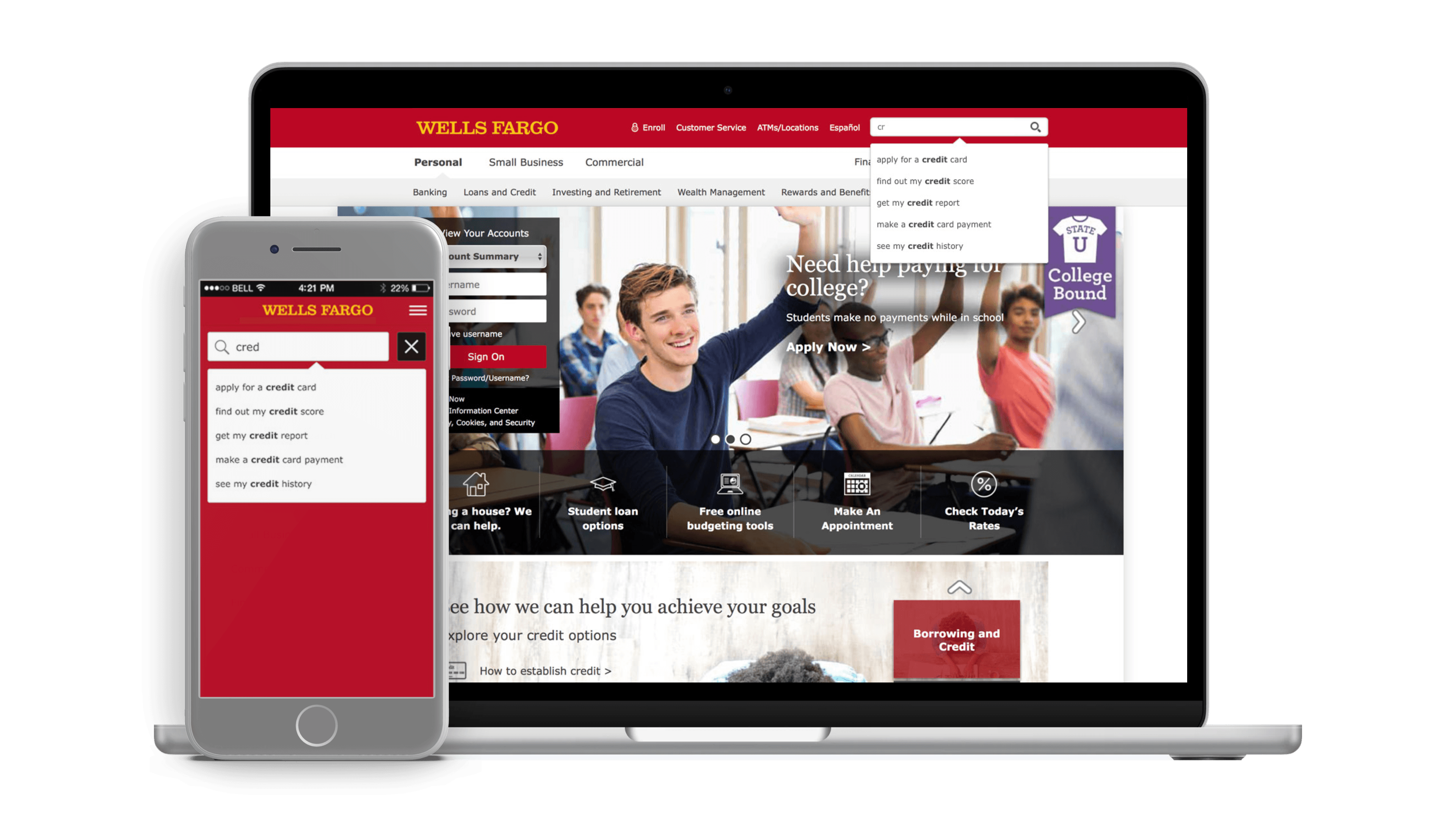
The new Wells Fargo search experience brings the interaction patterns customers expect from modern eCommerce and consumer apps into a major bank's B2C website. A persistent magnifier trigger in the navigation opens a preview modal that immediately surfaces common questions — before the customer has typed anything. As they type, auto-suggest phrases written as customer tasks narrow the results in real time. The full results page uses an Action Card layout — branded, scannable cards with clear hierarchy and consistent CTAs guiding customers to products, services, and support.
Persistent Magnifier Trigger
Search is always one click away from anywhere on wellsfargo.com — no hunting for a search bar.
Auto-Suggest & Auto-Complete
Natural language phrases phrased as customer tasks appear as the user types — getting customers to results faster without completing their query.
Mobile Parity
Consistent search experience across desktop and mobile — aligned to the Digital Brand Standards governing every Wells Fargo surface.
Common Questions Modal
Default state surfaces the most frequent customer questions before typing begins — reducing zero-result dead ends.
Action Card Results Layout
Full results page uses branded, scannable cards with product context, clear visual hierarchy, and consistent CTAs throughout.
Hi-Fi Sketch Specifications
Pixel-precise specs covering all states, spacing, color tokens, and typography — enabling accurate engineering implementation with minimal rework.
Selected Work — Final Design

Default Search State
Persistent magnifier trigger, nav integration, with entry point
Auto-Suggest — Live Preview Dropdown
Natural language phrase suggestions appearing as the customer types

Common Questions — Default Modal
Zero-state preview modal surfacing top customer questions before input

Search Results
Full results page, mobile-optimised card layout

Action Cards
Branded action card layout with product context and CTAs

Search Results Preview Modal
Preview search results, with card layout with consistent hierarchy

Design Exploration — Filter & Sort Variants
Sort Options, Filter Panel — Expanded, Filter Panel — Collapsed
The Impact
A live search experience that helped Wells Fargo rank #1 in the industry.
The new search experience — Action Cards, Auto-Suggest, preview modal, and Digital Brand Standards applied throughout — shipped live to wellsfargo.com for all customers. It was one of several XD-led initiatives that contributed to Wells Fargo ranking #1 in best app and mobile experiences in 2019 per Business Insider — a direct validation of the digital transformation the Experience Design team drove during this period.
+1
Wells Fargo ranked best
app & mobile experience in 2019 — Business Insider
LIVE
New search experience
shipped to production on wellsfargo.com for all customers
85%
Task completion rate
chosen concept vs. 52% legacy
+33pts
Usability improvement vs. legacy search experience
eCommerce patterns raise the bar in FinTech
Banking customers don't lower their UX expectations because they're on a financial services site. Applying Action Card search patterns — borrowed from eCommerce — gave Wells Fargo's customers the scannable, actionable experience they expected, and the brand a flagship demonstration of its digital maturity.
Brand standards are a design multiplier
The Digital Style Toolkit and unified Brand Standards weren't constraints — they were accelerants. Every search component designed against the system contributed to coherence across the entire digital estate, not just the search page. Design at this scale only works when the foundation is shared.
User testing validates the right bet
Prototyping concept options in iRise and testing them with real customers in Wells Fargo's in-house lab — rather than relying on stakeholder intuition — was the decision that locked in the right direction. The 85% task-completion result wasn't just a data point; it was the mandate that aligned the entire product team behind the Action Card model.
Auto-suggest is a trust signal, not just a UX pattern
Phrasing auto-complete suggestions as customer tasks ('apply for a credit card', 'find out my credit score') rather than keyword fragments made the search feel like a knowledgeable guide rather than a database query — a critical distinction in a context where customer trust is everything.
Hi-fidelity specs close the design-to-code gap
Pixel-precise Sketch specifications covering all states, spacing, and color tokens meant engineering could implement accurately without back-and-forth. At enterprise scale, specification quality directly determines how much of the design intent survives the build process.