UX Research
UI / UX Design
A simple and intuitive internal tool enabling Kroger's business analysts and developers to reprocess cost change records without manual back-end intervention — eliminating error-prone workarounds and giving users a UI with built-in business rules to get reprocessing right the first time.

90%
reduction in weekly reprocessing workload — from ~10 hours per week to under 1 hour
2
core design solutions targeting the highest-impact pain points in the flow
5
additional UX enhancements designed to reduce friction across the full experience
0
back-end developer interventions required once the tool is in use
The Problem
A critical business process held together by manual effort and developer time.
By January 2024, the number of successful cost changes was declining quarter over quarter. The product owner asked me to conduct user research, verify cost change processes, and determine mechanisms to increase efficiency and adoption. What the research confirmed was that the current manual "backdoor" reprocessing process — while understood by users — was creating compounding friction at every step.
Users understood the vision of what RepTool could provide. But without a purpose-built experience, even small issues — a mistyped Supplier Site ID, difficulty selecting multiple locations, no way to search for Case UPCs — cascaded into problems that users didn't feel equipped to resolve on their own.
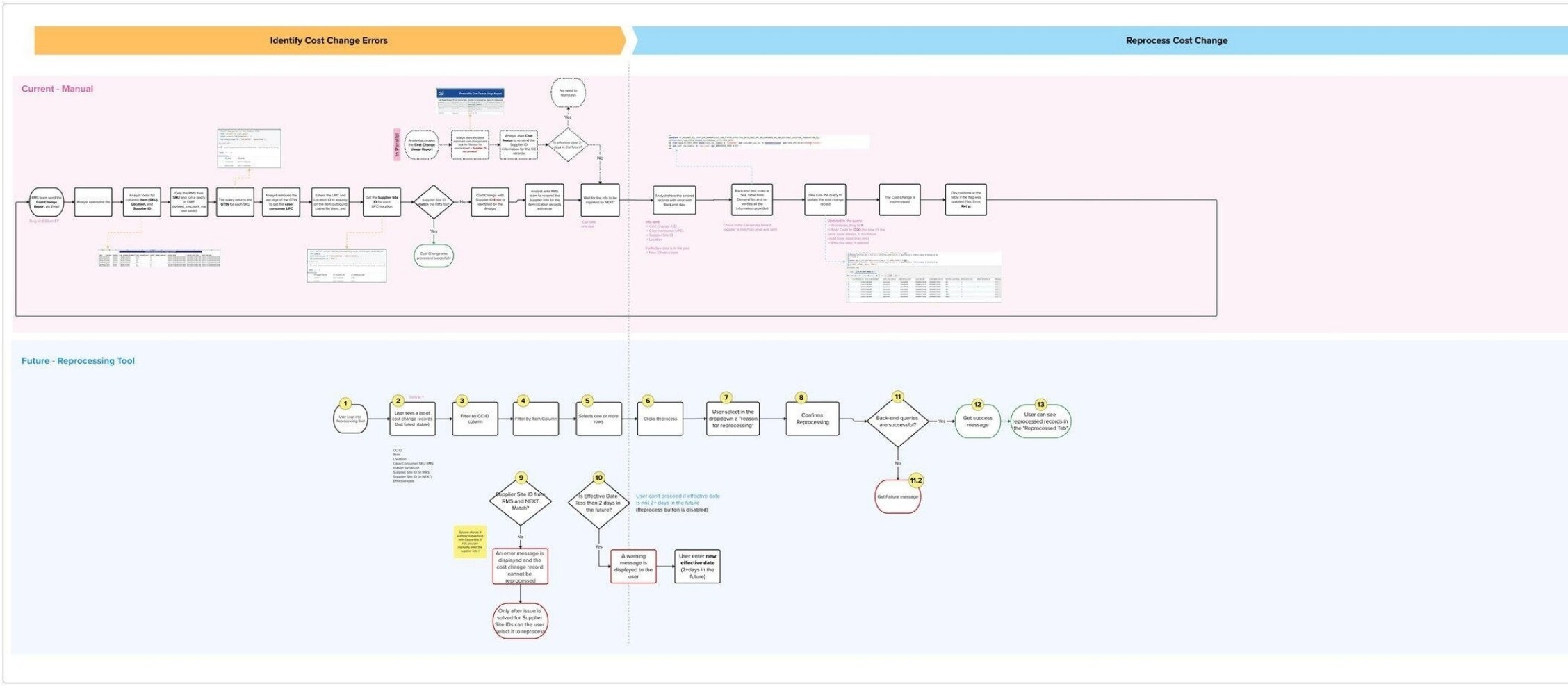
Current State Process
Five steps to reprocess a cost change — with a developer bottleneck in the middle.
The existing process mapped across five stages, with a critical dependency on back-end developer availability every time a Supplier Site ID mismatch occurred. RMS sends Cost Change Report

The Approach
Research first — then designing directly from what users told us.
Partnered with a Senior UX Architect, I designed and executed a structured lived inside this process every day — then translated findings directly into the interaction model and UI for the new tool.
01
Ethnographic Research: I employed three complementary methodologies: observation (Known Observer method, watching analysts work through the manual process in real conditions), immersion (working side-by-side with the team to understand the full texture of the backdoor reprocessing workflow), and one-on-one interviews (to go deeper into specific friction points and opportunity areas). Primary participants were business analysts and developers with direct experience of the manual cost change process; secondary participants included category managers who would be potential future users.
02
Discovery — Mapping Current & Future State: After sitting with the operations team to document their existing workflow step by step, I mapped the current manual process across two phases: identifying errors and reprocessing them. I then designed a 13-step future-state flow the tool would need to support — covering filtering, validation, reason selection, and success/failure feedback. This process map became the foundation for every design decision that followed.
03
Synthesis — Mural Whiteboard & Future-State Flow: Findings were transcribed into a Mural whiteboard, cataloging individual responses from each participant and grouping them into logical categories and sub-categories of unique findings. From that synthesis, I developed a future-state flow based on the current manual process and the business requirements — which became the direct foundation for the wireframes, UI decisions, and role-specific recommendations delivered to the product team.
04
Design — Two Core Solutions & Five Enhancements: Research directly shaped the design work. The two highest-priority solutions — the new Search Page and the Select Multiple UPCs & Locations page — targeted the root causes of the most common and impactful failures in the current process. Five additional UX enhancements addressed the compounding friction points surfaced in interviews, each tied to a specific finding from the research.
Current & Future State Interaction Flows
Design solutions — two primary, five supporting enhancements
New Search Page
— Allows users to view and edit cost changes in a format that matches their expected mental model
— Replaces the Excel-and-query workflow with a common, familiar search-and-select interaction
— Designed to reduce the cognitive overhead of working across disconnected tools and files
Select Multiple UPCs & Locations
— Provides the ability to add, edit, and delete one or more UPCs and locations in a single deliberate interaction
— Eliminates the per-record manual handling that was creating bottlenecks at scale
— Designed for intentionality — bulk actions are confirmed before execution
Effective Date Input with Inline Messaging
— Updating a date triggers inline messaging that clearly surfaces what data has been changed
— A sub-interaction pattern that makes edits visible and reviewable before submission
— Prevents silent errors that previously made it to the back end undetected
Effective Date Input with Inline Messaging
— Introduces an explicit "Select reason for reprocessing" action before the user can commit—
— Creates an audit trail tied to intent — not just action
— Reduces accidental reprocessing and gives the system context for downstream validatio
Supplier Site ID Mismatch, Success & Error State Pages
Lo-Fi Design & A/B Usability Test
When the team disagreed on bulk edit, I ran a rapid A/B test to find out who was right.
I started with a low-fidelity wireframe in Mural covering the error tracking dashboard, filtering panel, and reprocessing confirmation flow. During review with the product and engineering teams, different approaches emerged for the bulk edit functionality. Rather than debate it, I ran a rapid A/B usability test with 6 internal participants comparing two interaction approaches.

VARIATION A
Contextual inline toolbar on row selection
Bulk Edit action only visible in-context — appears when a row is selected. Cleaner interface but the capability is hidden until
needed.
VARIATION B
Dedicated bulk edit button always visible in table header
Row selection appears only after the button is clicked. The action is always discoverable but adds persistent visual weight to the
interface.
THE WINNER — HYBRID SOLUTION
Checkboxes and contextual toolbar from Variation A, with a persistent visible Reprocess label on the selection banner.
The test surfaced a nuance neither variation alone had resolved. The hybrid gave users the cleaner interface of A while keeping the explicit labeling that Variation B participants wanted — making the reprocessing action discoverable without cluttering the default view.
The Solution
A purpose-built RepTool that eliminates manual back-end intervention entirely.
The final high-fidelity UI was built in Figma and delivered as a fully interactive prototype for developer handoff. The design centers on three principles: clarity, control, and trust — giving the operations team everything needed to identify, investigate, and resolve failed cost change records without involving engineering. The tool handles the full reprocessing cycle, including Supplier Site ID mismatches, in a single self-contained interface.
Four core design decisions defined the final UI — clear visual separation between Failed and Reprocessed records, an inline notes panel per record replacing informal Slack threads, color-coded status indicators immediately scannable at a glance, and a required reprocessing reason field before any submission.
New Search Page
A familiar search-and-select interface replacing the Excel-and-query workflow — matching the mental model analysts already had for finding and editing records.
Select Multiple UPCs & Locations
Bulk add, edit, and delete of UPCs and locations in a single deliberate interaction — eliminating the per-record manual handling that created bottlenecks at scale.
Effective Date Inline Messaging
Date edits trigger inline messaging showing exactly what changed — catching input errors before they reach the back end.
Confirmation with Reason Selection
An explicit "Select reason for reprocessing" step before execution — creating an audit trail and reducing accidental reprocessing.
Mismatch, Success & Error States
Three distinct outcome pages replacing a single ambiguous result — each with a clear explanation and specific next action.
Automated Backdoor Processing
Certain Supplier Site ID mismatch tasks that previously required developer database queries are now handled automatically by the tool.
Selected Screens — Final Design Review

Landing / Search Page
Final UI — cost change lookup
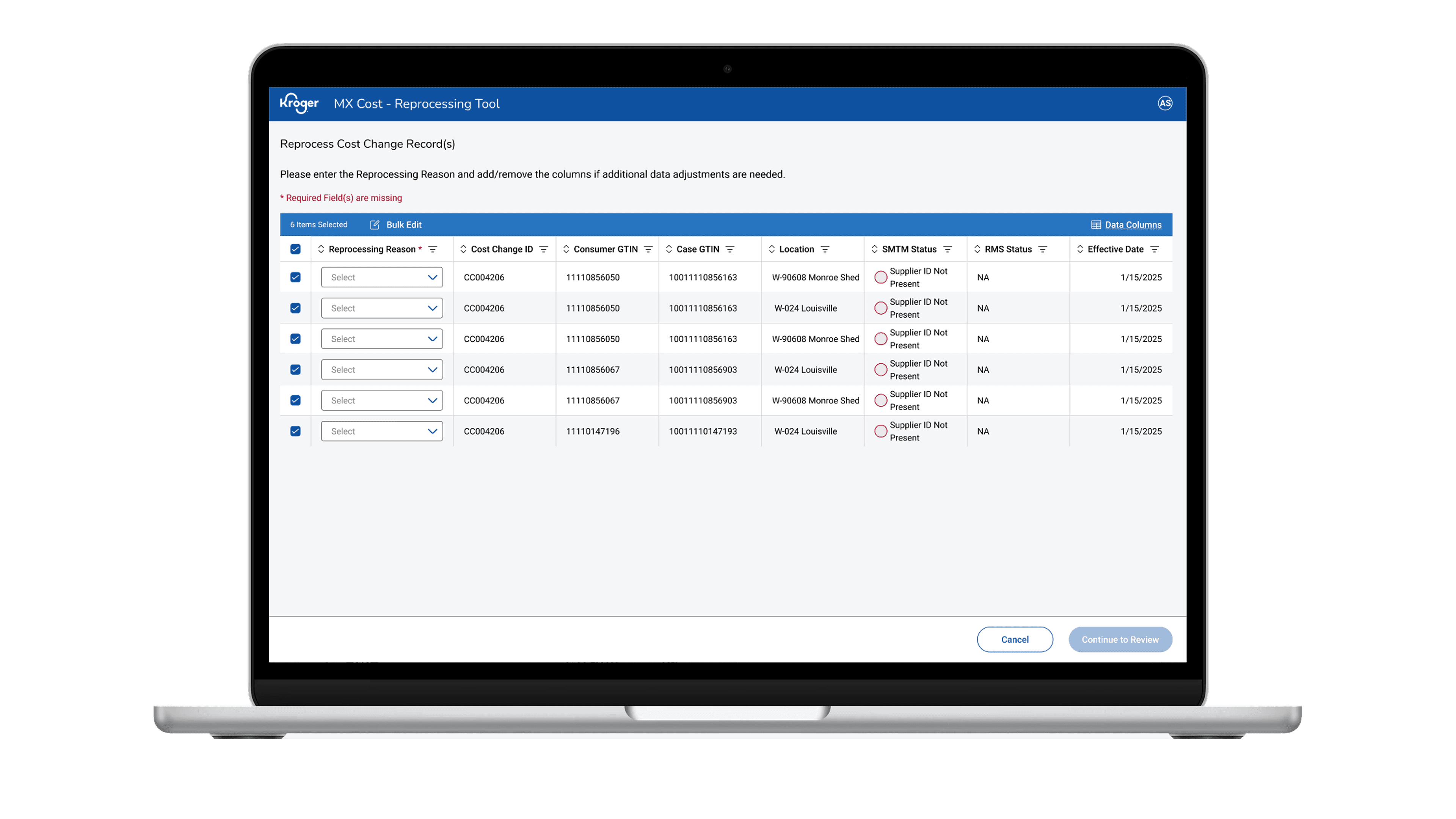
Select Multiple UPCs & Locations
Final UI — bulk selection flow

Effective Date & Confirmation Pop-Up
Wireframe concepts — inline messaging
The Impact
A manual workaround replaced by a tool designed for the people who use it.
The RepTool delivered a user-centered experience that eliminated the primary bottleneck in Kroger's cost change workflow. The operations team reduced reprocessing time from 10 hours to under 1 hour per week — a 90% reduction. Engineering was freed from ad-hoc reprocessing requests. All failed records became visible, trackable, and actionable in a single interface. The inline notes panel gave the team an audit trail they had never had before, and the required reason field reduced re-failure rateswhile improving data quality.