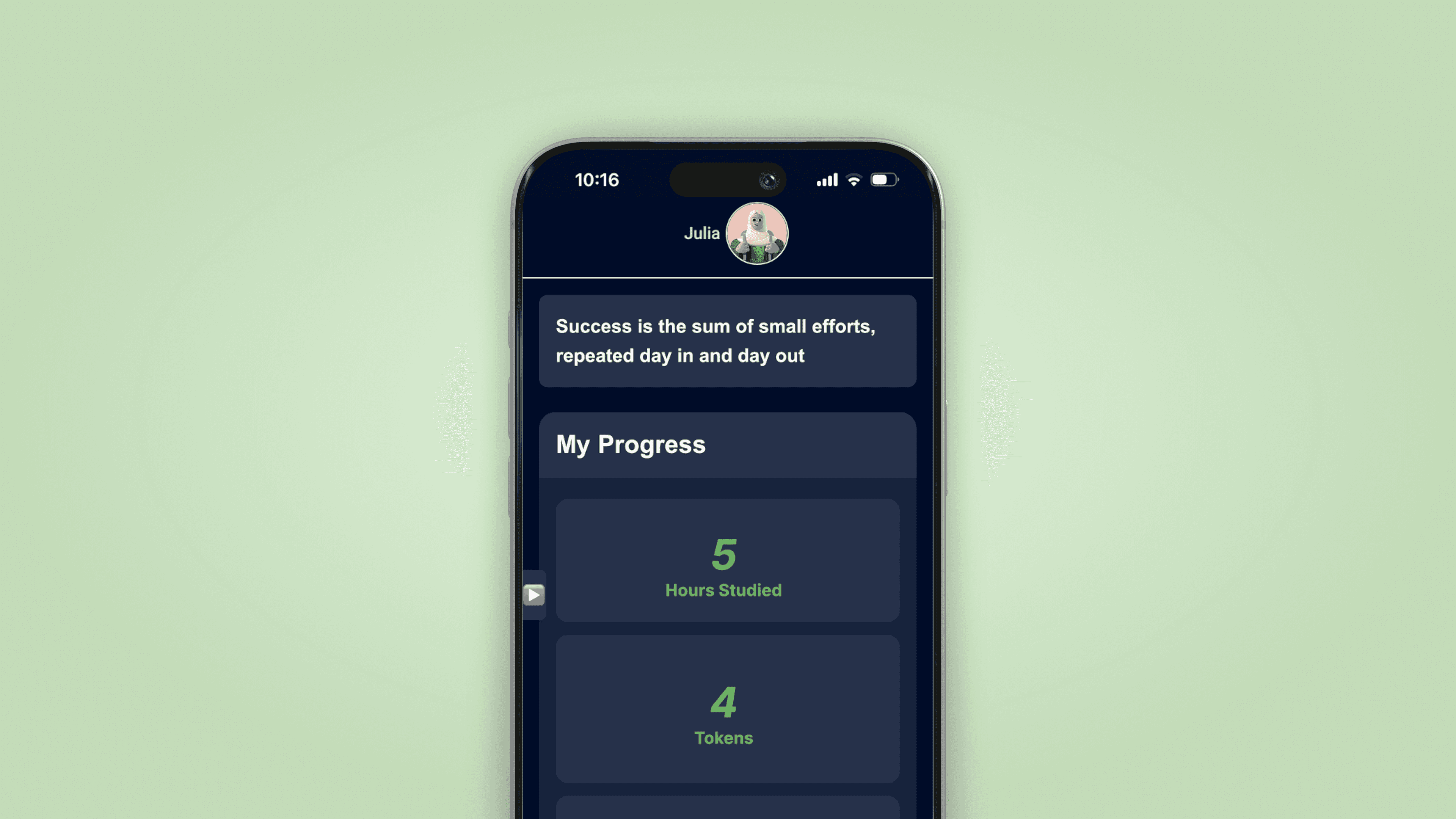
UX Research
UI / UX Design
A retail employee productivity app enabling Lowe's Associates to tender transactions anywhere — in a store aisle, the parking lot, at a delivery vehicle, or at a customer's job site. I led the product design and conducted the long-form ethnographic research that shaped the path forward.


$867k
total mobile checkout sales at time of research
6,522
transactions completed across the pilot stores
25
store associates and leaders interviewed across 4 locations
9
high-level findings informing the path forward for expansion
The Problem
Sales and transactions were trending down. Stores needed answers.
By January 2021, Mobile Checkout had expanded from a 6-store pilot to 33 stores across the country. But the data told a concerning story: sales and transactions were declining post-holiday season, and the number of stores actively using Mobile Checkout was dropping. Only 17 of the original 33 stores were still using it.
The platform had the right idea — but something between the vision and the store floor was breaking down. The question was whether the issues lived in the hardware, the software, the training, the rollout process, or some combination of all four. Without getting into stores and talking directly to Associates, there was no way to know.
What was happening in stores
Associates losing confidence after hardware and connectivity failures mid-transaction
Zebra devices incompatible with InVue cases and Ingenico PED — requiring updates or full replacement
Associates figuring out deployment through trial and error, without clear process guidance
Loss prevention concerns going unaddressed — every participant flagged this as a risk
User access taking 1–2 weeks to provision, slowing adoption before it could start
What the research needed to determine
How well stores understood how to deploy Mobile Checkout end-to-end
How leadership and associates actually felt about the experience
Whether the app was genuinely helping Associates in their daily work
Which roles should be prioritized for training and rollout first
Which use cases and store locations were most viable for immediate expansion
What process, training, and communication improvements were most urgent
The Approach
Going into stores to understand what no usage data could tell us.
Partnered with a Senior UX Architect, I designed and executed a structured in-store ethnographic research study — visiting 4 stores across 3 states, interviewing 25 participants across 8 distinct roles, and immersing directly in the store environment to understand the full texture of the Mobile Checkout experience from the floor.
01
Research Planning & Question Development: I partnered with a Senior UX Architect to draft our ethnographic research questions, build a structured research plan verified with the project team and stakeholders, and establish consistent methods and protocols across all store visits. The plan ensured common questions were asked of the right participant groups and that findings could be meaningfully compared across locations.
02
Ethnographic Field Research: I employed three complementary methodologies in store: observation (Known Observer method, to understand team activities without influencing behavior), immersion (embedding side-by-side with Associates to experience the real constraints of their environment), and one-on-one interviews (to go deeper into specific pain points and areas of opportunity). Primary participants were store leadership and Associates actively using Mobile Checkout; secondary participants included roles that could use it in future rollouts.
03
Participant Recruitment & Bias Prevention: I recruited 25 participants across Store Manager, ASM, Head Cashier, Department Supervisor, Pro Sales Specialist, and Appliance Sales Specialist roles. All identifying information was obscured to ensure honest, unguarded feedback. Interview design actively prevented leading questions, confirmation bias, and social desirability effects — methodological rigor that made the findings actionable rather than anecdotal.
04
Analysis & Synthesis: Findings were transcribed into an InVision Freehand document, cataloging individual responses from each participant across all four stores. We grouped findings into logical categories and sub-categories, elevating the most consistent and impactful patterns into nine high-level findings — each paired with specific, prioritized recommendations for the product and deployment teams.
05
Design Response — Hardware, UX, and Process: Research findings directly shaped my design work. For the PED connectivity issue — the single most confidence-breaking failure Associates experienced — I developed three solutions: a PED status indicator in the cart view, a persistent PED indicator in the navigation, and a new Pair Device screen. I also progressed the Customer Lookup experience, introducing a more explicit Add/Create action, a new Customer Details page, and a simplified Update and Save flow to eliminate a confusing dual-save pattern Associates were struggling with.


Nine high-level findings from the field
The Solution
Three PED connectivity fixes and a rebuilt Customer Lookup flow — directly addressing the two highest-impact failures in the field.
The research didn't just surface problems — it produced a prioritized design agenda. The two most confidence-breaking issues for Associates were hardware connectivity failures mid-transaction and a confusing Customer Lookup experience that caused errors and unnecessary re-submissions. The solution addressed both directly, with three distinct PED status design options and a fully redesigned Customer Lookup happy path.
The broader finding — that process, training, and loss prevention needed as much attention as the app itself — was delivered as a structured set of nine prioritized recommendations to the product and deployment teams, giving them a clear research-backed roadmap for the next phase of rollout.
PED Status Indicator embedded in the Cart view
Device connectivity status embedded persistently in the cart view — visible throughout the active transaction so Associates know immediately if something is wrong.
Persistent PED Indicator in the Navigation bar
I employed three complementary methodologies in store: observation (Known Observer method, to understand team activities without influencing behavior), immersion (embedding side-by-side with Associates to experience the real constraints of their environment.
New Pair Device Screen
A guided connectivity flow enabling Associates to resolve PED connection failures confidently — without needing technical support.
Customer Lookup — Add/Create
A more explicit Add/Create action replacing the ambiguous entry point that was causing Associates to lose their place in the transaction.
New Customer Details Page
A dedicated page surfacing the right customer information at the right point in the transaction — reducing back-and-forth and re-entry errors..
Unified Update & Save Action
A single Update action replacing the confusing dual-save pattern that was causing Associates to submit incorrectly or abandon the flow.
Design work produced in response to findings
Interaction Flow

Selected Work — Wireframes


Selected Work — Final Design

PED Indicator in Cart
Connectivity status during transaction

PED Indicator in Nav
Persistent device status bar

Pair Device Screen
Guided connectivity flow

Customer Lookup — Happy Path
Add, detail, update & save flow
The Impact
Research that gave the product team a clear path — and design work that addressed the most urgent pain points immediately.
The research findings provided Lowe's product and deployment teams with a grounded, evidence-based roadmap: nine prioritized findings with specific recommendations across UX, hardware, training, and rollout strategy. The design work produced in direct response to the research — PED connectivity solutions and the redesigned Customer Lookup flow — addressed the highest-confidence, highest-impact issues surfaced in the field.
Hardware failure is a UX problem
A Zebra device that won't connect to the PED isn't just a technical issue — it's a broken promise to the customer standing in the aisle. Surfacing device status visibly and consistently in the UI was the design intervention that mattered most.
Ethnographic research changes what you design for
Usage data showed sales were declining. Fieldwork revealed why. The difference between those two things is the difference between optimizing a failing experience and redesigning the right one.
Controlled rollout as product strategy
Associates and leadership didn't want to slow down Mobile Checkout — they wanted to do it right. Designing for a phased, role-specific rollout meant designing for the success conditions the stores themselves identified.
Process is part of the product experience
The app worked. The process around it didn't. Training, communication, loss prevention protocols, and hardware provisioning were all experience design problems — even when they didn't look like it from the outside.
Expansion at scale
Resolving connectivity and workflow pain points enabled expansion from 33 pilot stores to over 1,000 stores nationwide, driving a 406% increase in Mobile Checkout sales within four months.